
MOBILE OPTIMIZATION AND YOU!
Take a moment and think about your daily routines. You wake up, start a pot of coffee and reach for what first? The newspaper, or your smart device? More than likely, the answer is the latter. And, much like the ad section of the weekly journal, you avoid poorly designed websites with unattractive design and information. Why? Because there aren’t enough minutes in the day to sift through poor websites, when you KNOW which are the best and fastest at delivering desired information. Welcome to the daily routine of your customers.
With technology's incessant growth as the #1 information resource, businesses are fighting tooth and nail to keep the user interested past the first three clicks, and failing to do so due partially to poor mobile layout, or as we say in the industry, poor "responsive design." Here at GSATi, we've got some insider tips that will help you keep your mobile web versions "responsive" and easy to access. Read on and learn more!
Make Offers Discoverable.

As a mobile website, the allotted space available to promote offers or products is extremely limited. To ensure that your company's services are quickly and easily understood, create a simple layout that users can scan through, and gain an overall sense of what you have to offer. Take our clients Arogalife, for example. For their mobile site version, we created a scrollable carousel of internal pages that describe the primary functions of Arogalife and its Wellness Partners. Guests are immediately introduced to Arogalife services and on the fast track to purchase.
Sell by way of beautiful imagery.
Let's think back on that morning routine we talked about earlier. Remember the bit about unattractive design? Well, it's true. Recent studies have shown that 70% of consumers delete [emails] that don't render well on a mobile device. Meaning, 70% of your customers are driven to competitor websites based on the failure of imagery appeal by other companies. Whether it be high-resolution images or well-implicated designs, your design choices are what sell product the fastest and best. GSATi clients Boisset Ambassadors Collection use high-quality images of their products and on-site location to attract users to the beauty and class of their company and its products, as if to fully immerse the user in their elegant lifestyle. The user comes to the website for the product and stays for the company culture, all thanks to a few well-curated images.

Maintain Simplicity
Less is always more. Loading times are critical when keeping a user on your page. Cluttering your mobile site with large videos or large images increases loading time and ergo decreases the users' patience. This applies to text as well. Long paragraphs or titles are neither visually appealing nor easily scrollable when searching for product information via mobile. Try using large, clickable buttons that lead to different product pages, like what we've created for Arogalife in their shopping section. Large buttons paired with little to no overpowering product description enables a faster purchasing time, which means more revenue for you and your business.
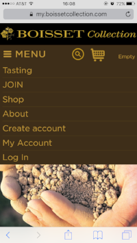
Make Menu Moves: Drop Down and Sidebar Menus
This is a very small but significant necessity for any mobile site: a drop down or sidebar menu and significantly contributes to the discoverability of a website. Having a menu that's easily accessible with minimal surfing interference provides easy navigation for users as they explore your company. Check out Boisset’s drop down menu: easily discoverable, large click-able buttons, the works. Menus are available to make searching easy, make your menus easy to find and use and you’re on the track to success.
Keep it Consistent: Fluidity between Mobile and Web Versions
At GSATi, we keep it consistent with responsive design. Meaning: our sites are, as aforementioned, “responsive,” or malleable, between online and desktop versions. Users are able to jump from computer to smart device and still see the same high-res images, discover products quickly, and make purchases with ease. We recognize that consistency is key to maintaining online reputability, and are proactive to make sure that all visitors are provided with equal ease in use and implication. This should ring true for your business as well. Keep it fluid, keep it consistent, keep it easy.
We hope our tips are “responsive” to any potential concerns you and your business may have about mobile optimization. Have any further questions or would like to learn how GSATi can help you optimize your site? Start your journey with us today.